Reporters in my newsroom make beautiful charts on their own and yours can too
The rise of Chartbuilder
By David Yanofsky a reporter at Quartz

In the begining there was a styleguide
Make chart in Excel Copy-paste Into Illustrator resize restyle export upload
This was our workflow, it was slow
And then there was everyone else
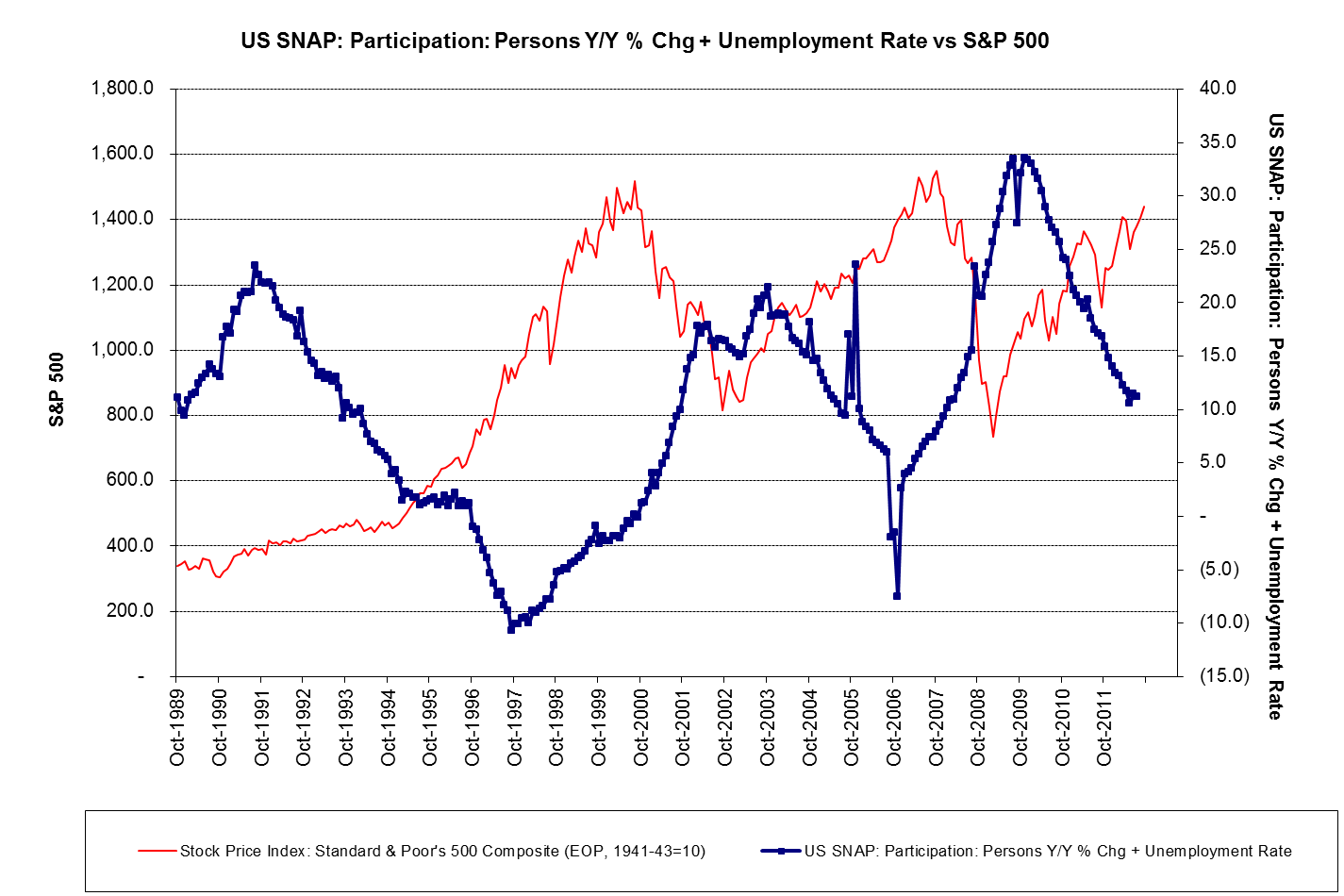
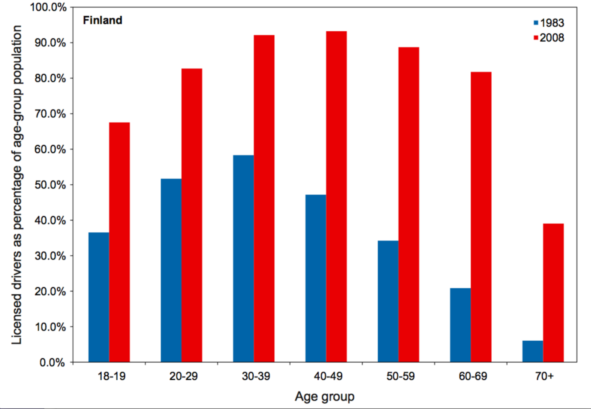
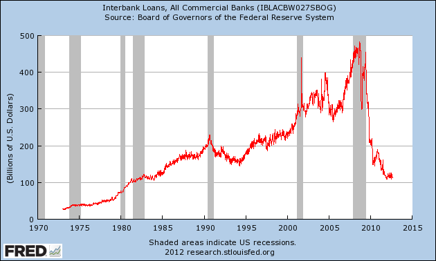
Illegible, ugly, inconsistent
Bottleneck at production
Ugly charts, beautiful site
We had two problems
Fix my problem first
build a new tool
Paste data into Chartbuilder copy-paste SVG node into text doc open in Illustrator export upload
My workflow under this tool
I wanted image download (and didn't want to set up a server)
found canvg.js
Paste data into Chartbuilder export as image upload
workflow with canvg.js
Released it to the newsroom
It was buggy and only made line charts with single data series
Saves time
Chartbuilder covers 75% of our charting needs
Gives greater independence to everyone
Your charts are on you, and thats a good thing
Enhances ourglobal coverage
Hong Kong, Bangkok, Mumbai, Los Angeles, Paris, London: round the world graphics coverage
Our site looks better, and is more legible
Spawned other tools
Typothinger

Soon: Mapbuilder
Provides a foundation for future product enhancement
Thank You
David Yanofsky
@YAN0
Quartz
qz.com
http://yanofsky.info/demos/chartbuilder
On Github soon